

Money overview
Understand the relationship between income, spending and balances, with recent transactions close at hand.
Veylora is a personal finance product concept that connects daily spending with monthly commitments and longer-term goals.
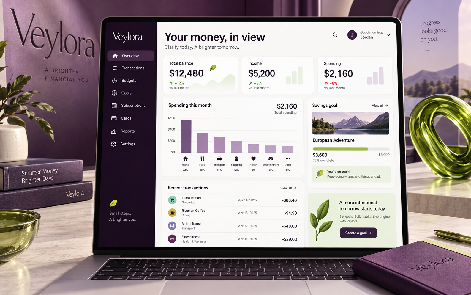
Veylora explores how a personal finance workspace can make everyday money easier to understand. The experience connects an overview of balances and transactions with category budgets, purposeful savings and upcoming commitments. A user can move from noticing a change in spending to checking a budget or reviewing a renewal without reconstructing the picture across separate screens. The design scope includes information architecture, dashboard hierarchy, financial data visualization and a consistent visual identity across the main workflows.
A balance alone does not explain what a person can comfortably spend. Recurring charges, planned purchases and savings commitments all compete for attention, while dense transaction lists make meaningful patterns difficult to spot. The design challenge was to bring those signals together without making routine money management feel like maintaining a spreadsheet.
The proposed experience starts with a concise overview and allows users to explore the detail behind each number. Budgets show both spending and the amount remaining; goal cards pair progress with contribution schedules; and recurring payments have a dedicated view of costs and renewal dates. Shared navigation and consistent status labels keep these workflows connected.
Inside the platform
Product concept screens with fictional financial data.
The design brings four complementary views into a cohesive finance concept: overview, budgets, goals and recurring payments. It establishes a clear visual hierarchy and a shared way to read financial information across the product. The next validation step would be usability testing around interpreting a budget, locating an upcoming payment and understanding goal progress.
4Designed finance views
1Connected product concept
Ready to build something similar?
Whether it's a platform for your industry or something completely different, we can help you build, integrate and scale.