

Glyph editor
Inspect an original letterform with visible contour handles and spacing guides.
Glypharo brings typeface design into a visual workspace built around the records, decisions and reviews that shape the work.
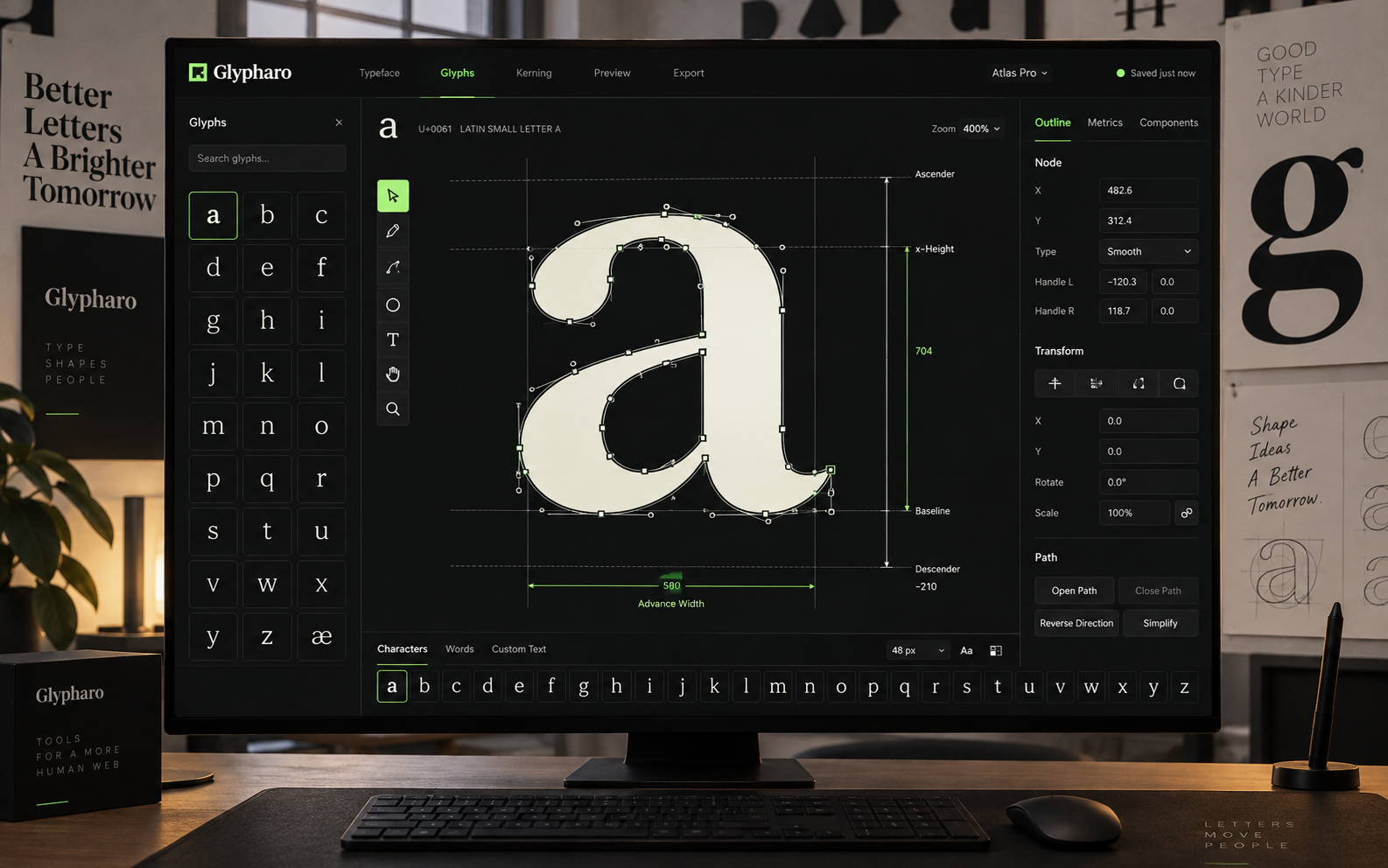
Glypharo is a product design concept for typeface design. Typeface designers need letterform changes evaluated both as individual glyphs and in real text context. The scope connects four activities: glyph editor, spacing studio, specimen board, design critique. Each has a dedicated screen, with a huge glyph canvas with contour tools and a bottom character strip establishing the visual direction. The work includes interface composition, proposed feature architecture and industry-specific showcase imagery.
Typeface designers need letterform changes evaluated both as individual glyphs and in real text context. A useful workspace must preserve the connection between the original reference, the selected record and the discussion around a change. Showing more information alone would not resolve that handoff.
The design starts with a huge glyph canvas with contour tools and a bottom character strip. Inspect an original letterform with visible contour handles and spacing guides. The remaining views separate exploration, coordination and review into layouts suited to their content. A black, ivory and acid green palette gives the product its own visual identity, while selected-record panels keep details close to the working surface.
Inside the platform
Four original typeface design interface concepts. Records, technical values and depicted workflows are illustrative.
The design establishes four distinct typeface design views and a proposed set of twelve feature areas. The visual system prioritizes the working object and its context rather than repeated metric cards. A next validation would ask a practitioner to move from glyph editor to design critique, identify the selected record and retrieve the relevant revision comparison. These are design deliverables, not measured business outcomes.
4Specialized concept views
12Proposed feature areas
Ready to build something similar?
Whether it's a platform for your industry or something completely different, we can help you build, integrate and scale.